interior inspirations: upscale industrial
I don't typically talk about my "day job" on here but I recently had the amazing opportunity of designing my company's new office on Wall Street. From concept to completion it took about 6 months. It was a very aggressive timeline to say the least. It aged me by say.... 10 years... but it was and is my proudest moment. There were a lot of moving parts and it was definitely a team effort.
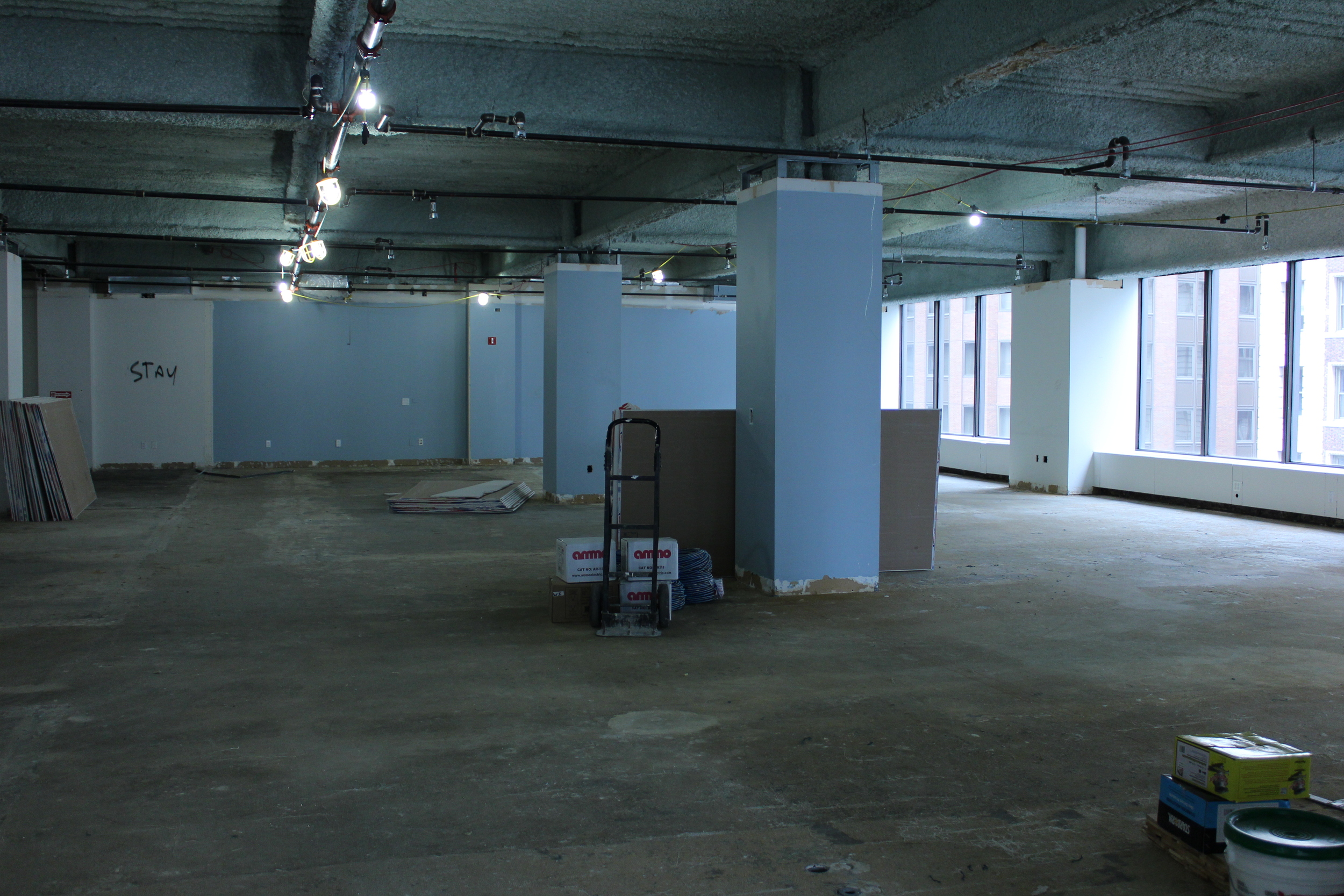
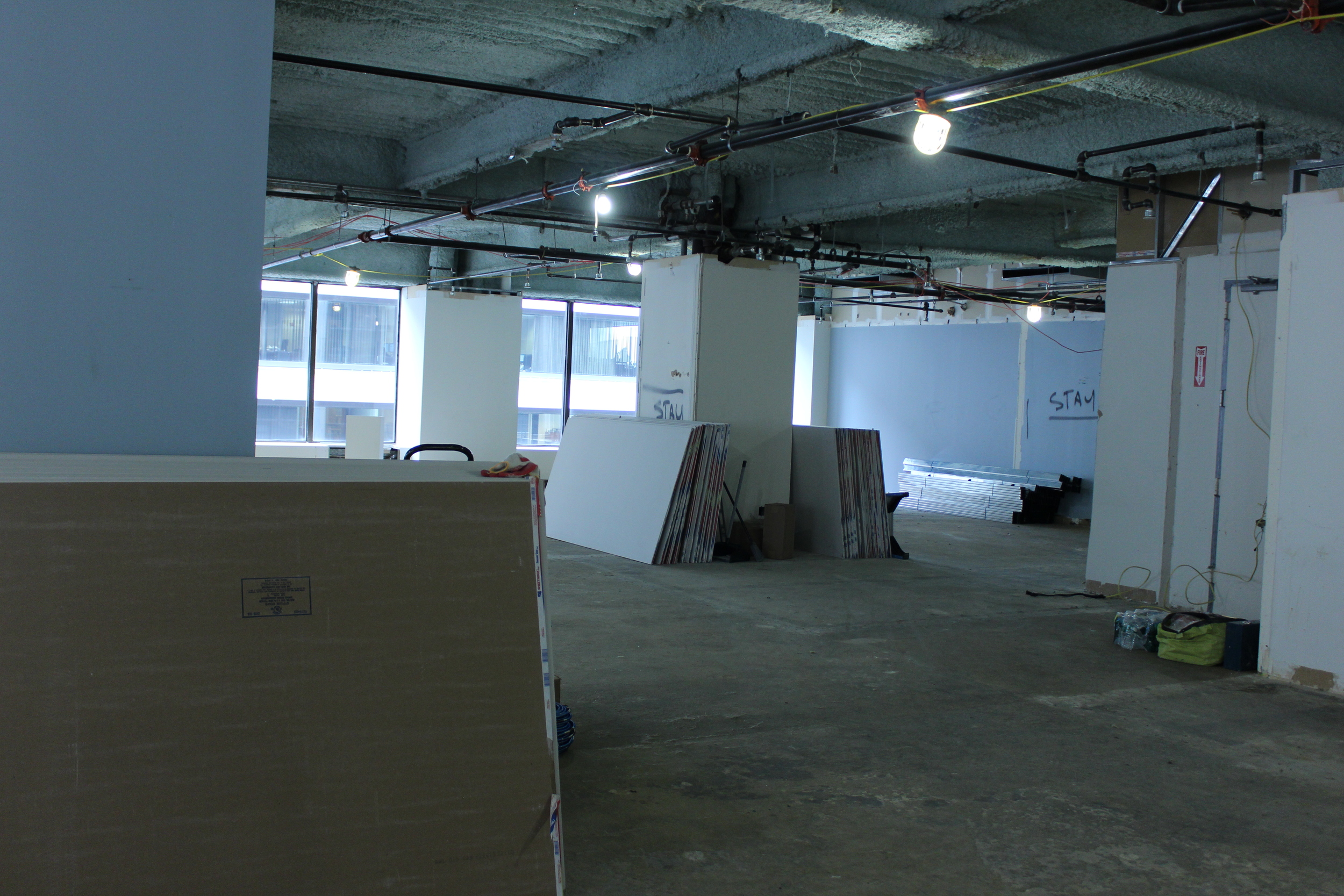
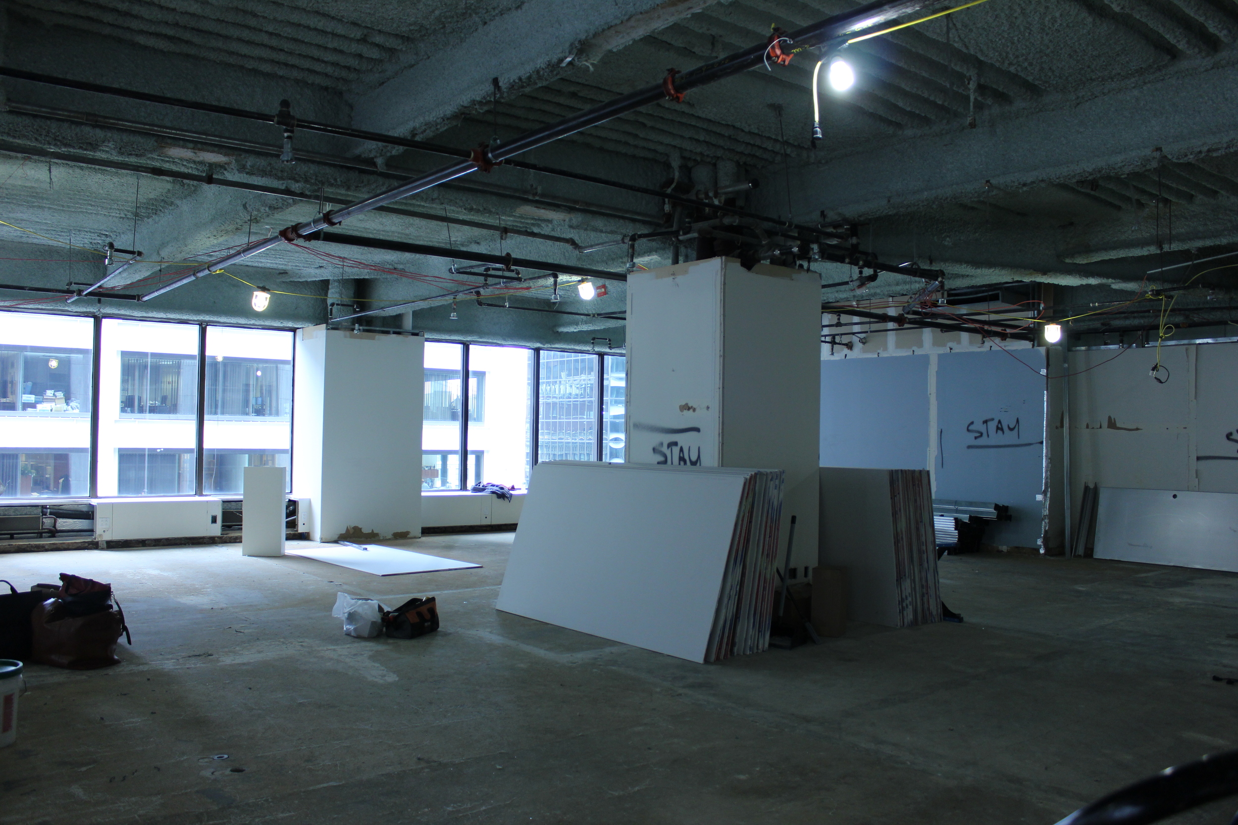
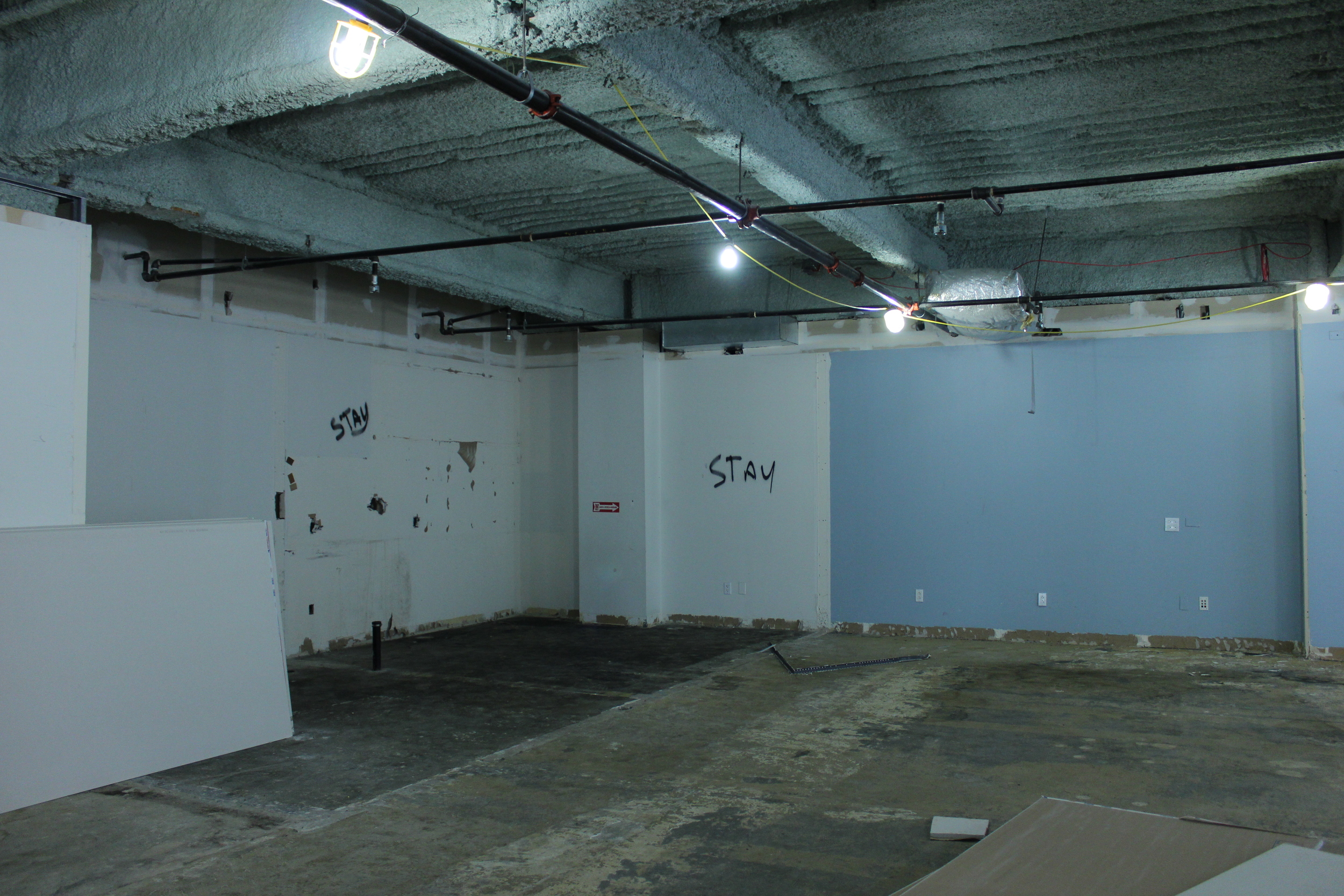
We started with a raw space as seen in the photos below. It's so cool to see where we started and where we ended up. The over all concept was clean, upscale, with just a hint of industrial. The goal was to encompass the aesthetic all three House of GANT collections with a nod to downtown NYC... and maybe I threw a little LA vibe in there as well.
So as you can see I got to start with a blank canvas! I have to say everything came together better than I imagined.
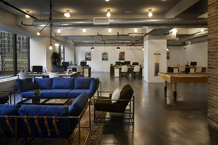
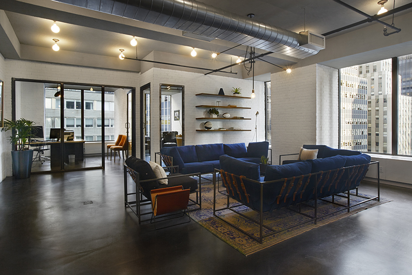
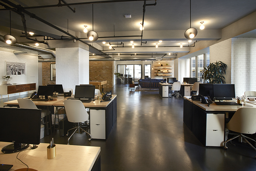
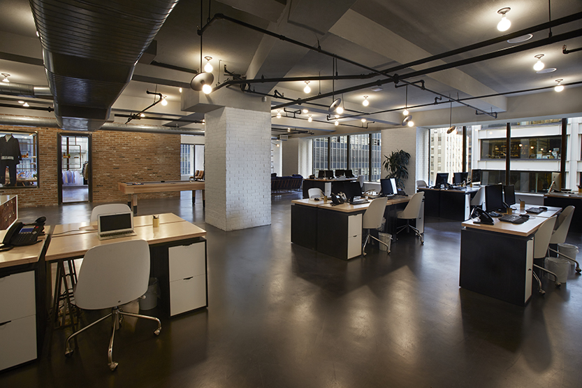
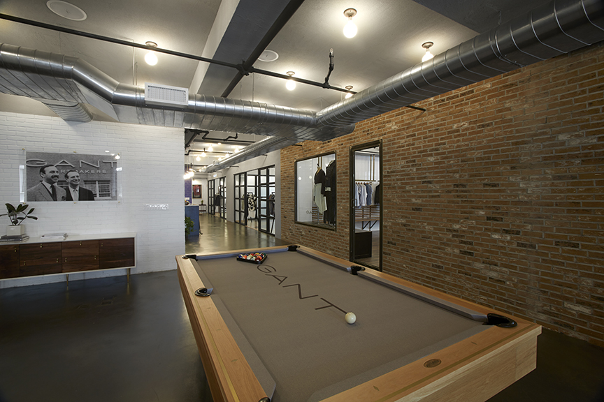
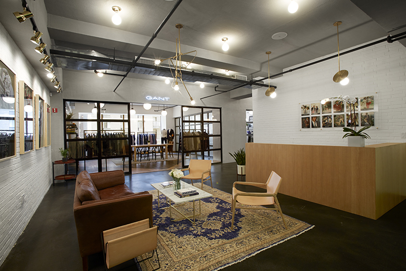
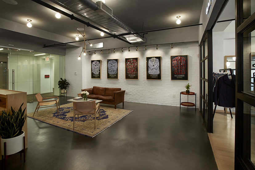
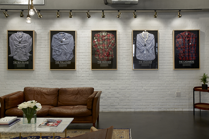
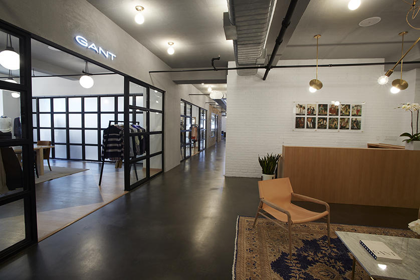
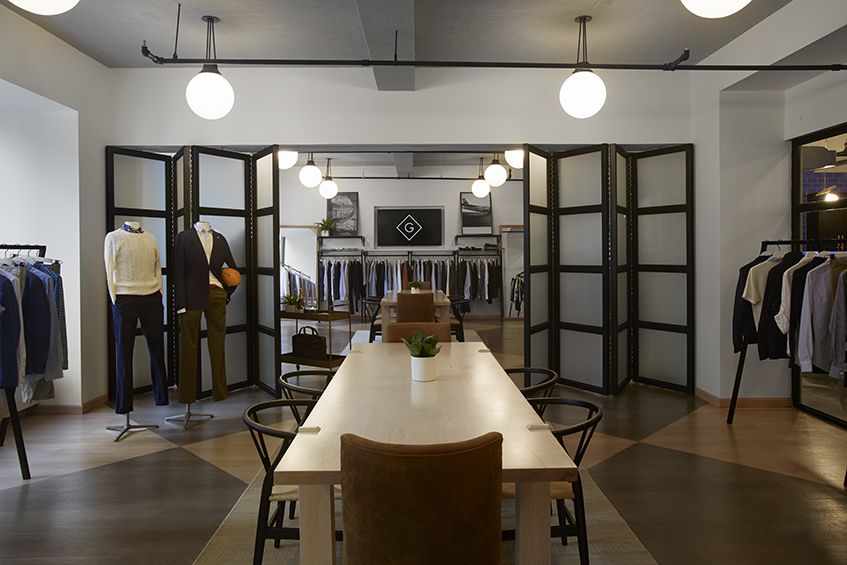
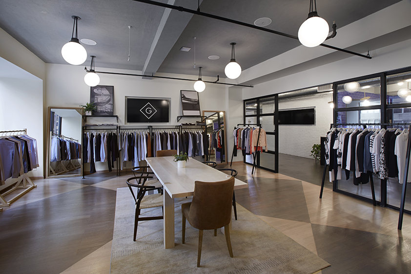
The floors are a sprayed concrete which were a great contrast to the white brick walls. Since we are in a commercial building an actual exposed ceiling would have been an eye sore. It would have looked like popcorn ceiling central. To achieve an exposed ceiling look, while running like hell away from a dropped ceiling tile situation, we built out a soffit that echoes the existing beams. We then applied a grey stucco so that the ceiling has more of a concrete look to it. The exposed pipes were painted a matte black which added to the whole clean industrial details of the space.
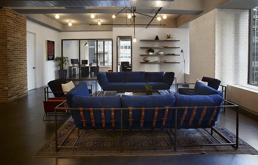
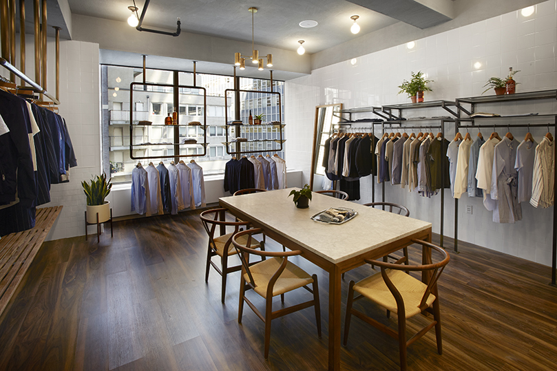
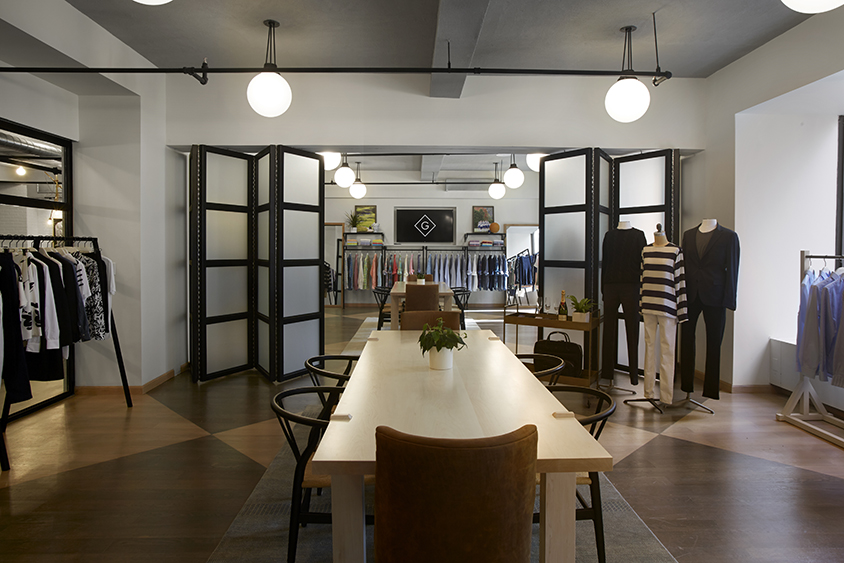
The lighting fixtures are a mix of School House Electric, Urban Archeology, and my personal favorite, Workstead. The pieces that excite me most in the space I would say are the couches by Stephen Kenn. I saw them at a GQ party right around the time I was starting to source the furniture for the office. I felt like they really encompassed the brand from the indigo dyed cushions to the vegetable dyed leather belts. They are also super comfortable and if I could take a nap on them everyday I would. The desks are my other favorite pieces which were designed by a company called Sawkille. I had found them one day while I was browsing on Instagram. Jonah Meyer, who I believe is the owner/founder, is just so talented. They built our tables in the large showrooms as well. They are absolutely gorgeous.
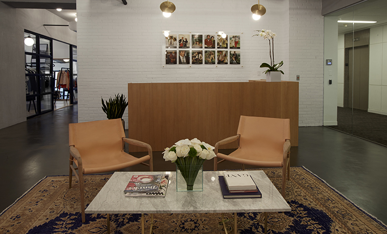
I also really love how the reception area came out. The danish modern pieces are by OX Denmarq out of.. you guessed it.. Denmark. The couch was a vintage piece I picked up from Brimfield as well as the carpet. The carpet was from a company I really fell in love with called Nomadic Trading Company. They had some really cool finds.
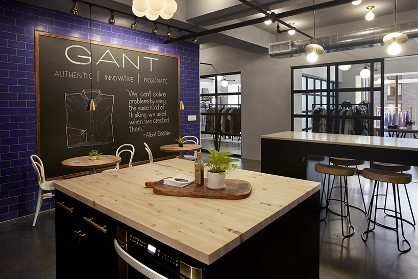
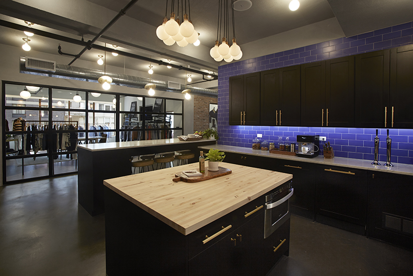
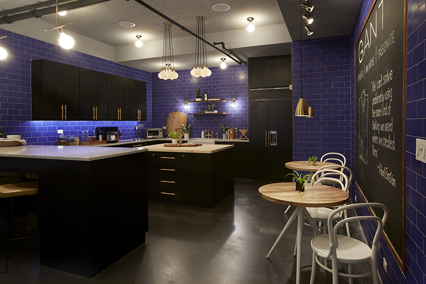
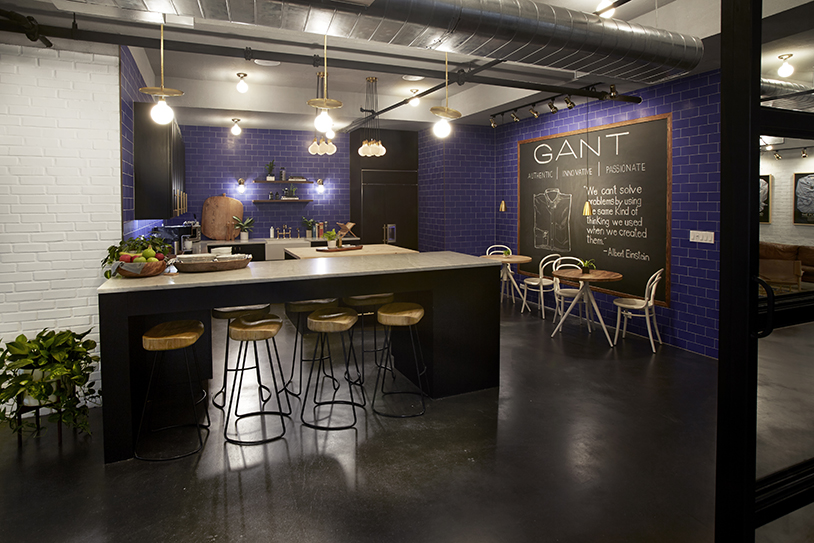
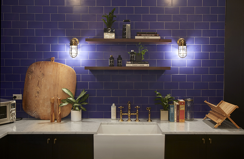
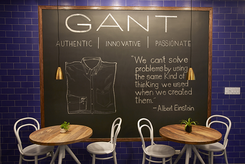
The kitchen is really what got everyone in the office excited. The blue tile came from our specific color of GANT Blue, but it also reminded me of the exterior of B Bar. It looks pretty awesome, especially against the white marble and black cabinets. The brass hardware in the kitchen is by Lewis Dolin. These ones I discovered on good old Pinterest!
I can't forget to mention the beautiful plants that are sprinkled throughout the space. These plants and pots were provided by The Sill. I have wanted to work with them for so long now. I am so excited to have their pieces in our space.
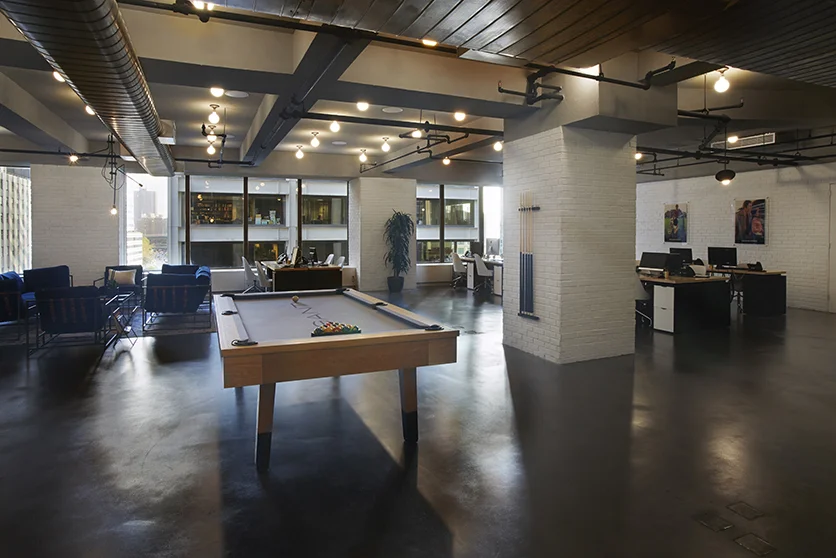
And lastly..... the custom pool table..... that.. pool table. I lost so much sleep over this pool table. All I can say is that it exists, it is here, and I can finally move on with my life. In all seriousness it really looks great. We use it waaaay more than I thought we would, and no one has shot a ball into a glass window... yet.
Just recently we had the talented Mr. Alastair Casey come in to photograph the space with all of its final touches. He did such a great job capturing all of the details.
This was definitely a unique experience and I feel like a proud mamma! I hope you all enjoyed the photos. If you have any questions about any of the pieces please leave a comment below!
